Utilization map for when user needs visualization
GoldenCompass as a hub to generate visualization
GoldenCompass visualization generation policy
GoldenCompass provides various visualization contents by itemized analysis results.
We provide chart contents utilizing PatentPia GoldenCompass with Apple as the interested company and augmented reality of Apple as the keyword of interest example. If you click on the chain(link) marks that are attached to each item in the above utilization map, the example page will open in a new window.
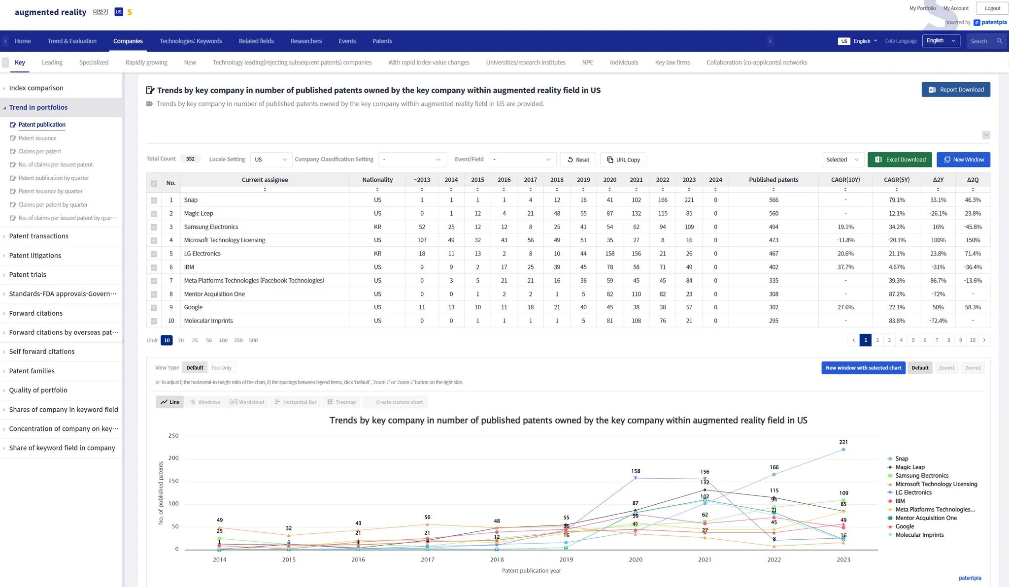
The analysis result page of GoldenCompass contains visualization contents such as i) analysis table, ii) chart, etc. The principle of visualization contents is to provide all the charts that the data presented in the analysis table allows. Therefore, at the bottom of one analysis table, multiple chart contents are provided. These different charts are just a click away.
The form of analysis table data and the kind of visualization possible are as follows.
Show All
Search
Depending on the number of rows and columns and the nature of the values, the original chart is derived from
Responsive - responds to visible analysis table data
Charts in GoldenCompass are responsive to analysis table data and change in real time. When you execute (i) filtering ii) sorting, (iii) selected item) on the breakdown table data, the visible breakdown table content changes, and the chart changes immediately in response to the breakdown table content.
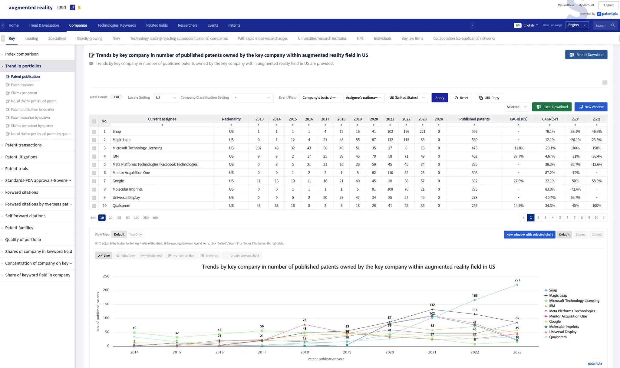
As an example, we present a chart before applying a filter and a chart after applying a filter. Because the analysis table data has changed as a result of applying the filter, the chart will look different.
Before applying the filter
On the Company analysis result page, filtering is applied based on the selected nationality by entering the following sequence: Filter → Company Basics → Right holder nationality → Select one of the listed nationalities (e.g., United States) → Click "Apply" button.
After applying the filter
After applying a filter, only filtered items are output in the analysis.
If you select a specific nationality through a filter, only companies of the selected nationality will be output.
Based on the changed analysis results, only companies of the selected nationality appear in charts, etc. Reports, etc. will also be composed of only companies of the selected nationality.
You can share/open/reproduce the analysis result page that displays only companies of the selected nationality by clicking "Copy URL" or using the URL in the address bar after clicking "New window".
GoldenCompass free chart
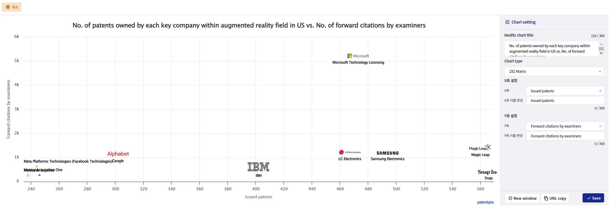
GoldenCompass provides a free chart feature that allows free variation on a given analysis table data. In Free Chart, you can change i) the chart title, ii) the indexes/variables (pairs) used in the chart, and iii) the type of chart. In addition, the finalized chart can be shared and reproduced via URL, etc.
Clicking "Generate Free Chart" on the far right of the chart type selection area will open a page where you can customize the chart.
Step 1: Select "Generate Free Chart"
Step 2: Change the chart settings
You can change the chart title and the controls that make up the composition of the chart (e.g., X-axis, Y-axis, etc.). For example, change the Y-axis to Concentration, and change the chart title accordingly.
Step 3: Click the 'Copy URL' button to copy the URL. You can copy the URL from the address bar on the page that comes up by clicking the 'View in New Window' button.
Track visualization utilization
Utilizing in Dashboards
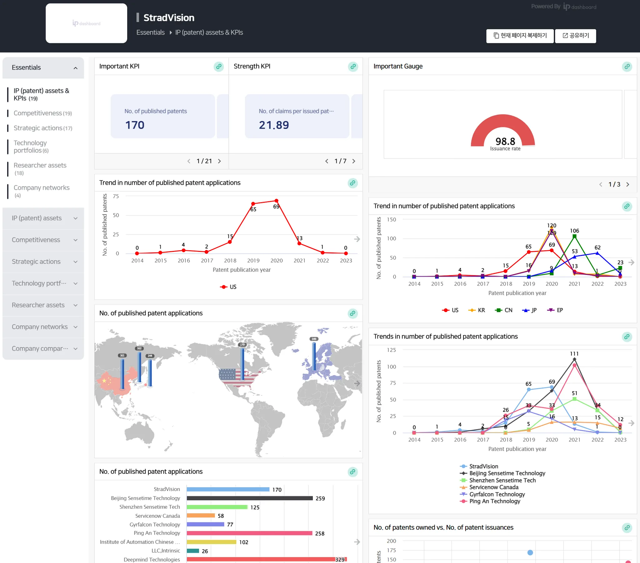
PatentPia Dashboard is a system that maximally utilizes the visualization contents generated by GoldenCompass. For more details, please refer to the PatentPia Dashboard manual.
Below is an example of a PatentPia Dashboard, the default dashboard for a specific company.
Utilizing in MS Word reports
PatentPia Report is a scheme to generate reports in MS Word files in real time by maximally utilizing the analysis contents and visualization contents generated by GoldenCompass. For details, please refer to the PatentPia Report manual.
Visualization reproduction-sharing and management via URL of chart
Chart URL
Every chart provided by PatentPia GoldenCompass has a chart URL. Chart URLs can be linked to, shared, or managed as managed objects. Charts linked or shared with a chart URL will be reproduced.
On the other hand, the Free Chart feature allows you to generate a variation of the chart (the final chart after free variation = Free Chart) with variations of the elements that make up the chart, such as axis variations like X/Y axis, etc. or chart titles. Free charts are also linked, shared, managed, and reproduced via URL. The URL of a free chart is copied by clicking 'Copy URL' on the free chart creation page. (On the other hand, the chart URL can also be used by clicking 'View in new window' to make the generated free chart appear on a separate page, and copying the URL in the address bar on the screen.)
Generate and utilizing visualizations with uploaded/inputted data
Meanwhile, PatentPia provides visualization contents services utilizing data uploaded by users through i) PatentPia Analytics, ii) My GoldenCompass (coming soon), etc.
Visualization Generation through Analytics
PatentPia Analytics is a system that provides more than 5,000 real-time analytics & visualizations for uploaded patent sets. For more information about Analytics, please refer to PatentPia Analytics manual page. To utilize the analysis & visualization features of Analytics, patent data can be uploaded through i) My platform utilization track, ii) Analytics Home (coming soon) utilization track, etc.
Generating visualizations with My GoldenCompass (coming soon)
My GoldenCompass provides various analysis & visualization contents on par with GoldenCompass for patent sets uploaded by users (with/without technology classification tree and other classification schemes). My GoldenCompass supports the same feature set as GoldenCompass, so you can take advantage of almost 100% of the visualization capabilities available through GoldenCompass.


