Chart contents and utilization schemes
•
Here is an example of chart contents utilizing PatentPia GoldenCompass with Apple as the interested company and augmented reality of Apple as the keyword of interest. If you click on the chain(link) marks that are attached to each item in the above utilization map, the example page will open in a new window.
Charting principles
Diversity
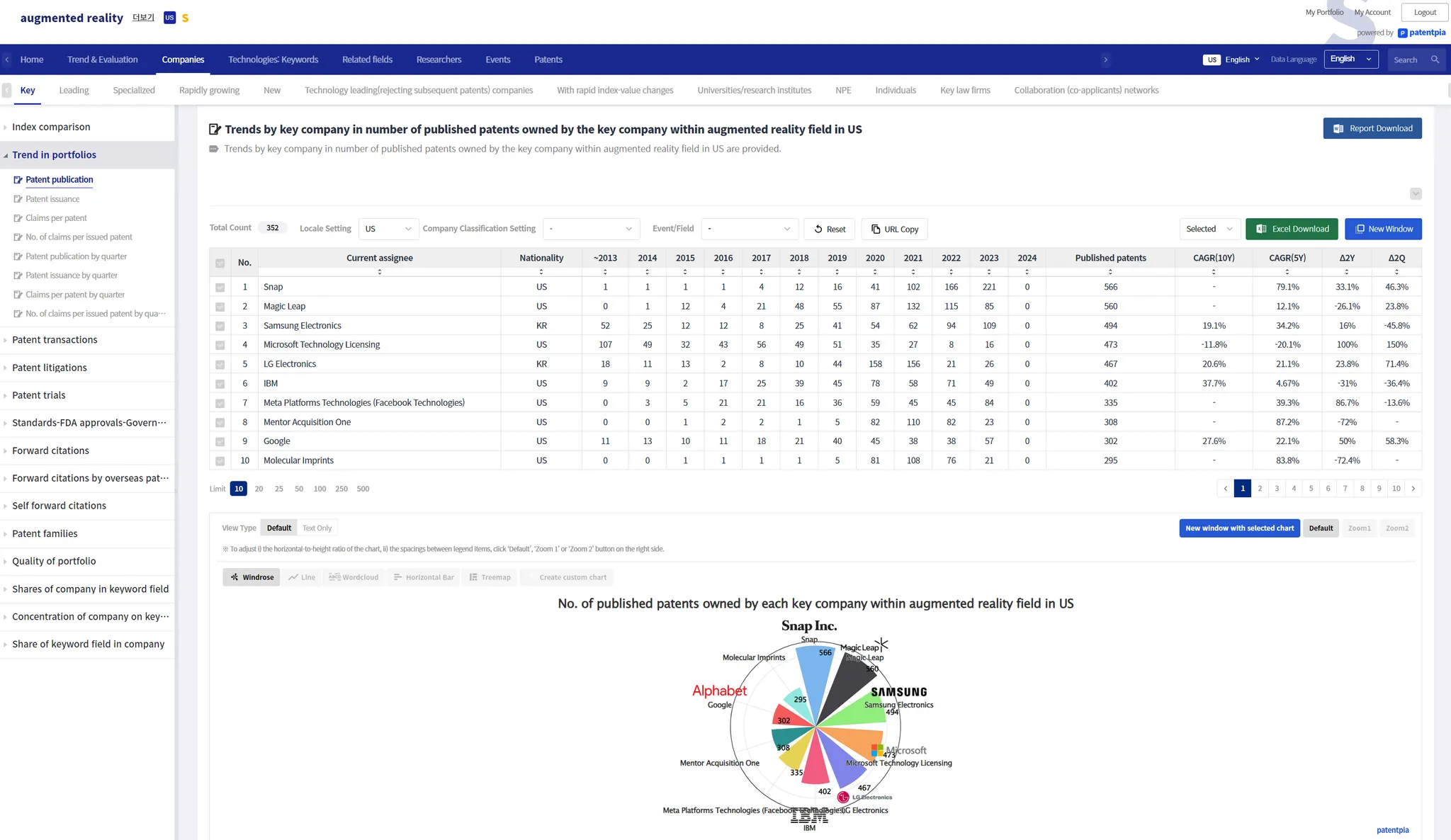
The analysis result page of GoldenCompass contains visualization contents such as i) analysis table, ii) chart, etc. The principle of visualization contents is to provide all the charts that the data presented in the analysis table allows. Therefore, at the bottom of one analysis table, multiple chart contents are provided. These different charts are just a click away.
The charts are possible depending on the shape of the analysis table data.
The form of analysis table data and the type of visualization possible are as follows.
Depending on the number of rows and columns and the nature of the values, the chart is derived from the following original source.
Responsive - responds to visible analysis table data
Charts in GoldenCompass are responsive to analysis table data and change in real time. When you execute (i) filtering ii) sorting, (iii) selected item) on the breakdown table data, the visible breakdown table content changes, and the chart changes immediately in response to the breakdown table content.
As an example, we present a chart before applying a filter and a chart after applying a filter. Because the analysis table data has changed as a result of applying the filter, the chart will look different.
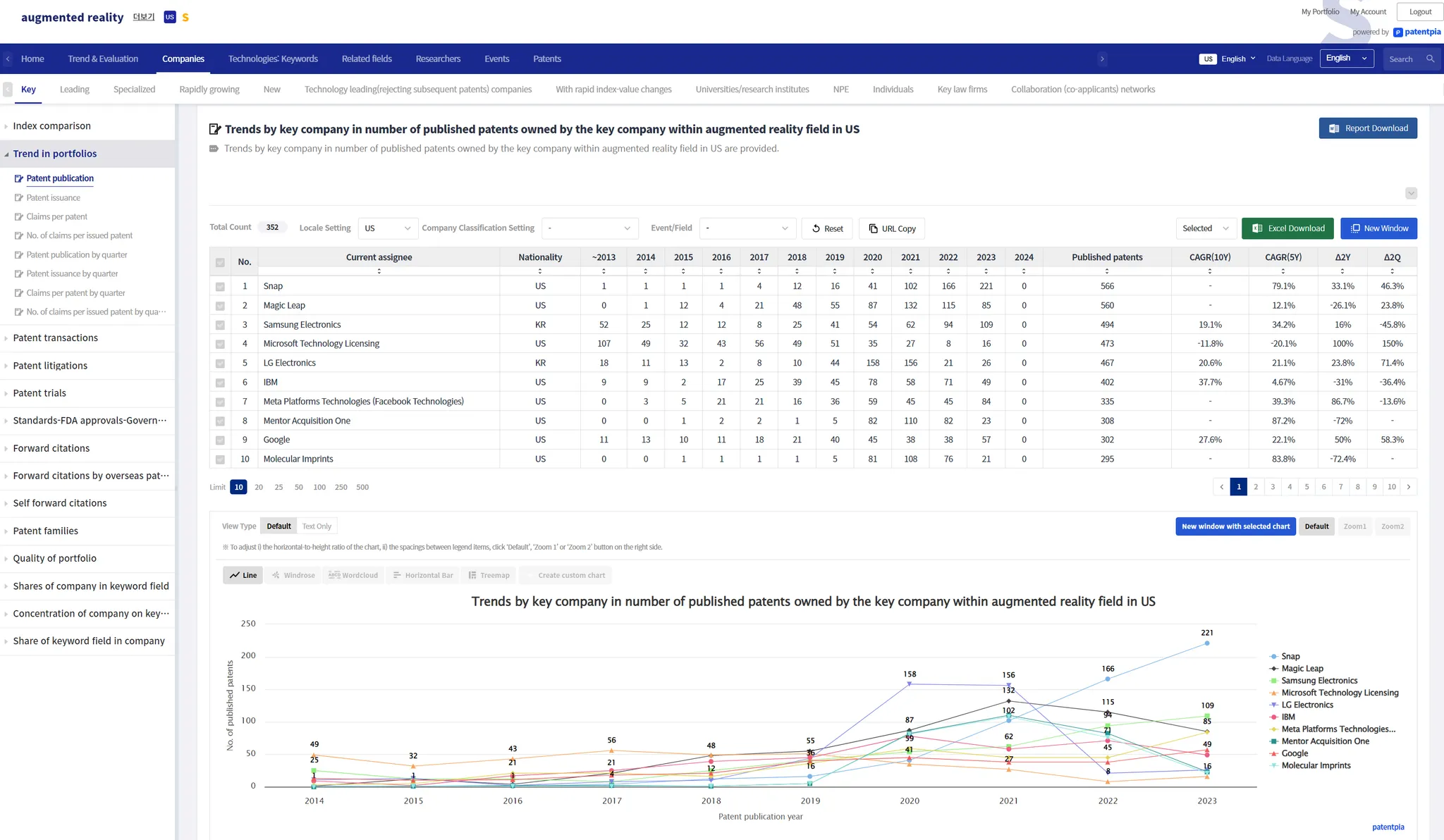
Before applying the filter
On the Company analysis result page, filtering is applied based on the selected nationality by entering the following sequence: Filter → Company Basics → Right holder nationality → Select one of the listed nationalities (e.g., United States) → Click "Apply" button.
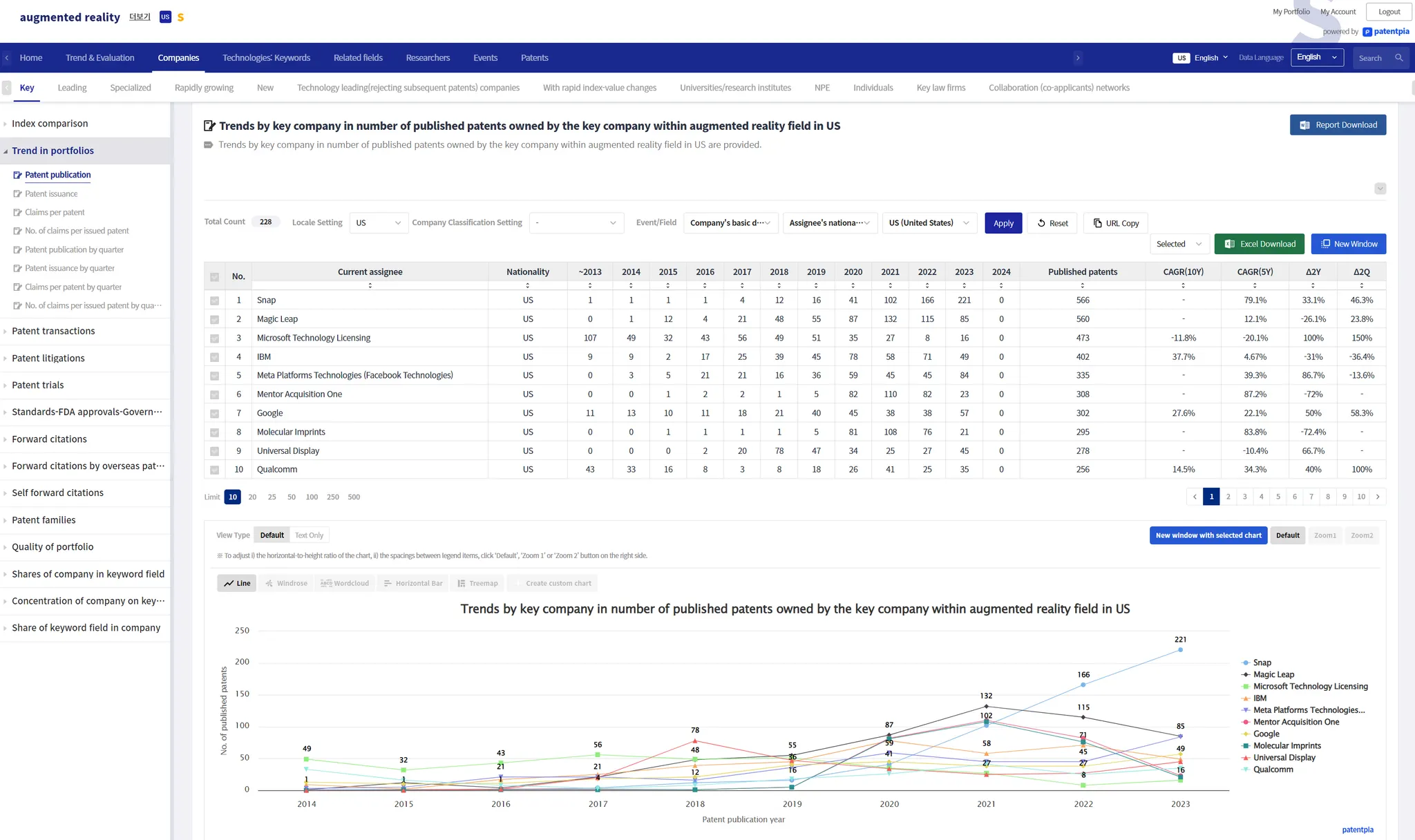
After applying the filter
After applying a filter, only filtered items are output in the analysis.
If you select a specific nationality through a filter, only companies of the selected nationality will be output.
Based on the changed analysis results, only companies of the selected nationality appear in charts, etc. Reports, etc. will also be composed of only companies of the selected nationality.
You can share/open/reproduce the analysis result page that displays only companies of the selected nationality by clicking "Copy URL" or using the URL in the address bar after clicking "New window".
Customization
GoldenCompass supports custom charts feature. Custom charts are refined & customized chart contents where the user has changed one or more of the following: i) Chart title, ii) Variable names used for axes, iii) Chart type, etc.
Share-oriented
GoldenCompass allows you to share a specific chart among the multiple charts that make up an analysis result page by utilizing a "Chart URL". When you click on the shared "Chart URL", the analysis result page will open and display the specific chart that was shared instead of the first chart.
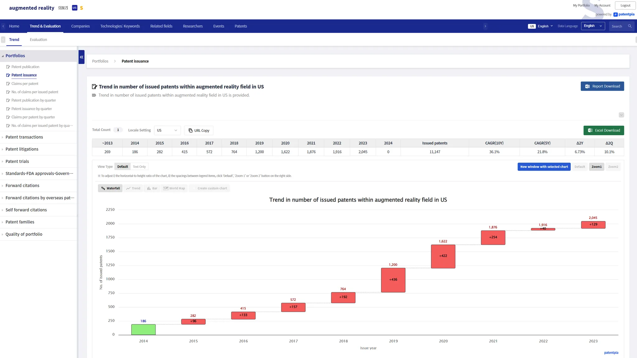
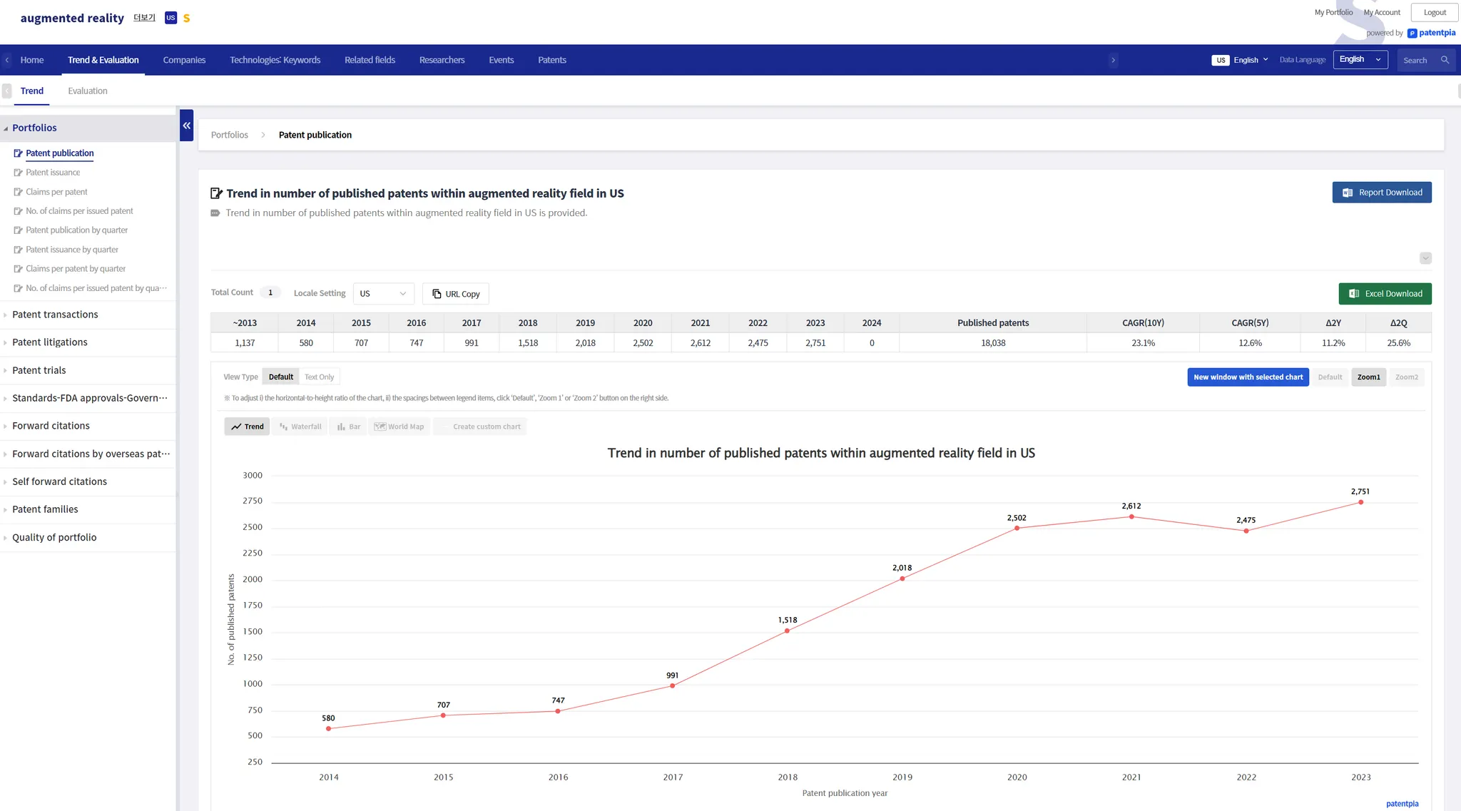
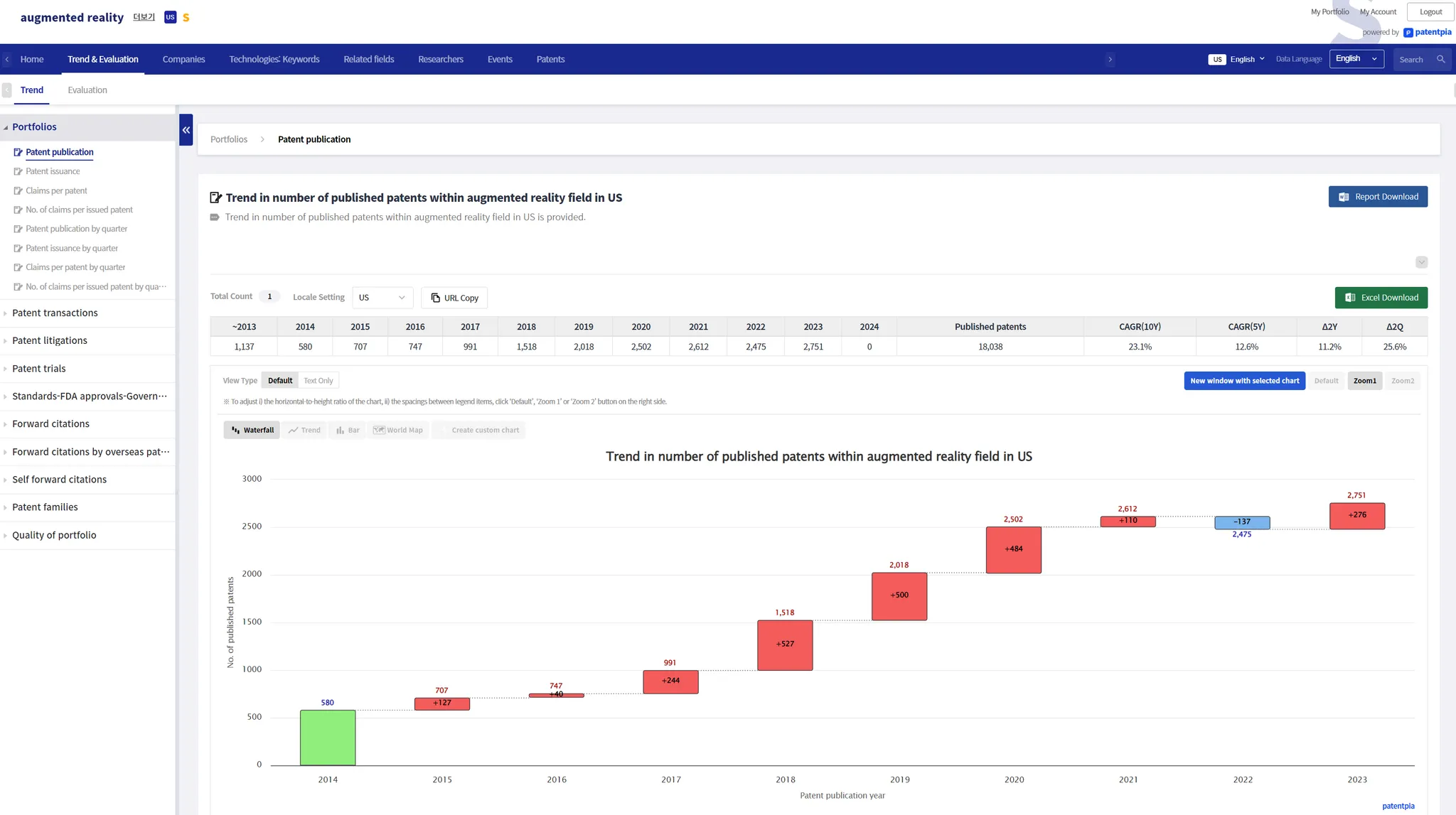
From the various charts that appear on the analysis result page, select the chart you want to share, then click "Copy URL". The clipboard will have a copy of the URL where the waterfall chart appears. When you share this URL, or hyperlink to the contents, the analysis result page with the waterfall chart will be reproduced. If you copy the URL in the web page address pane and then share it or hyperlink to the contents, the analysis result page is reproduced with the default chart, the trend chart, instead of the waterfall chart.
Chart Type
Time Series
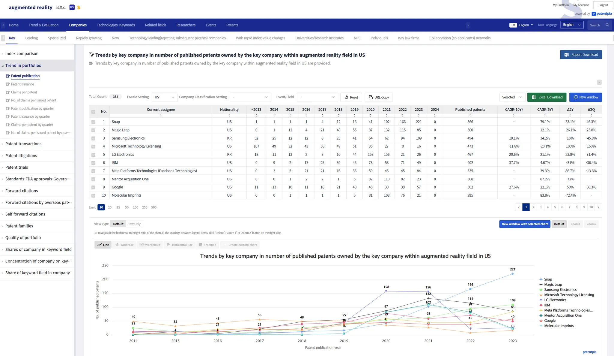
Time series charts have a 1-line time series (trend) and an n-line time series.
1-Line Time Series
The 1-line time series chart types are i) trend, ii) waterfall, and iii) bar.
n-line time series
n-line index
When the analytical table data is in the form of m indices on n line items, the most variety of charts is provided.
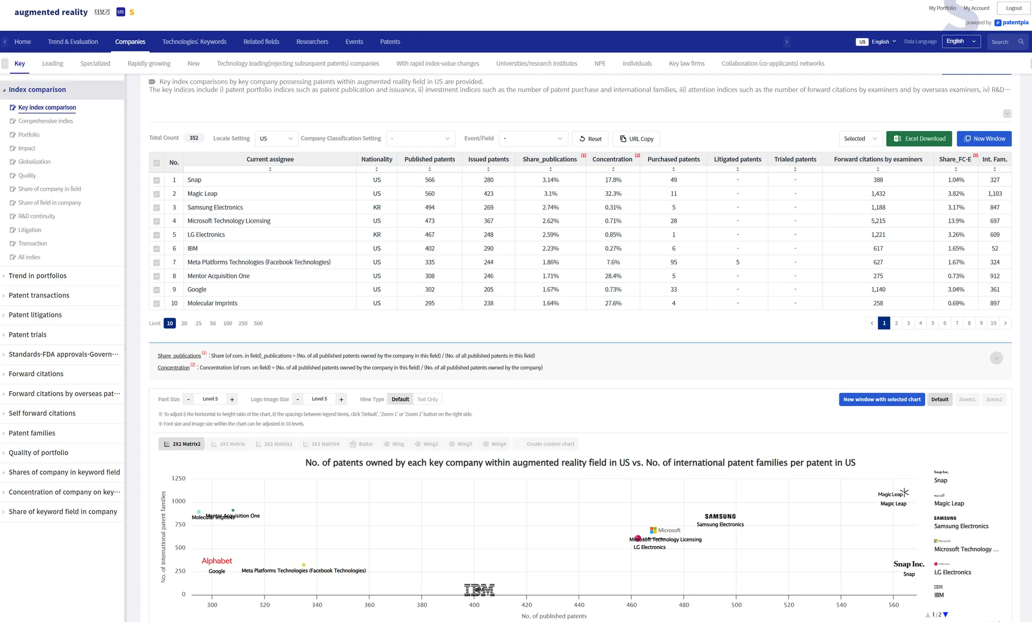
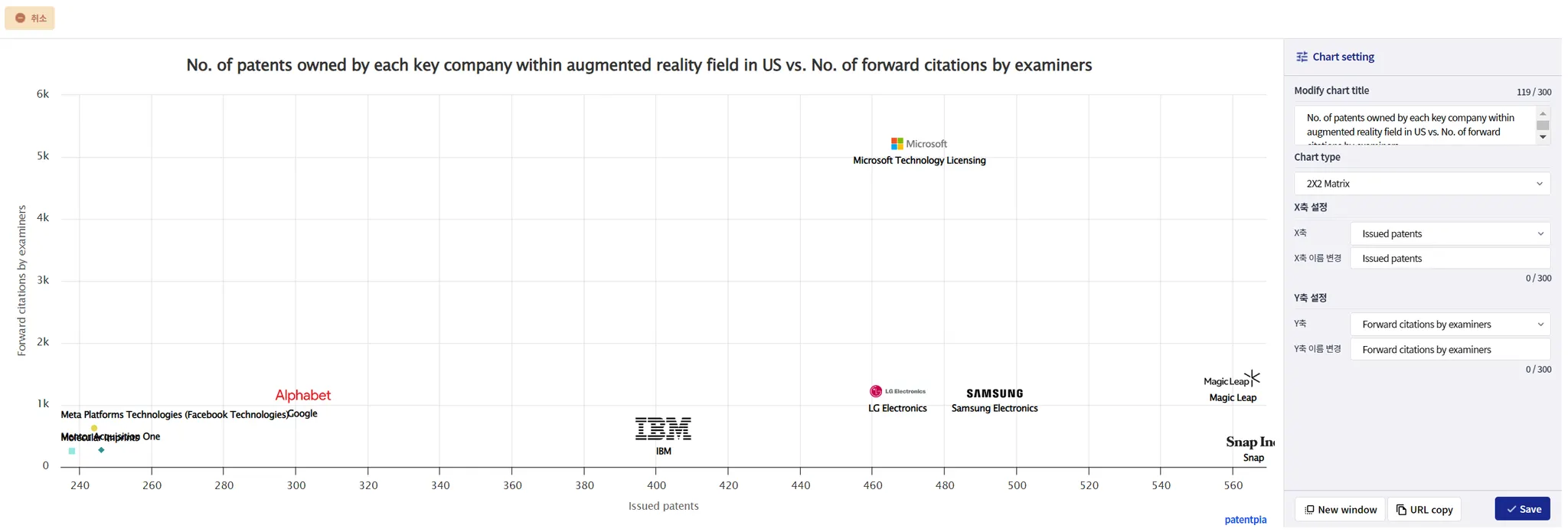
When the data is in the form of m indices of n-line items, free charts, which allow you to combine indices, are powerful because the indices are diverse. In particular, in the case of 2X2 matrix charts or wing charts, where you select 2 indices (pairs of 2 indices), you can generate customized charts that are intent/purpose-oriented by utilizing the free chart feature. Of course, the generated customized charts can be shared/opened and reproduced via URL, etc.
Network charts
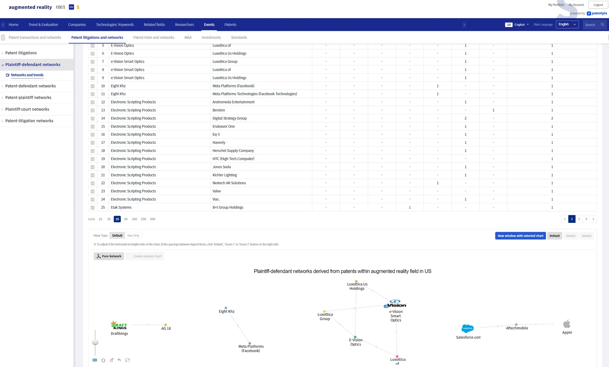
GoldenCompass provides network visualization contents for pair data forms.
Chart utilization
Share chart only
Share a chart URL that displays only the chart (coming soon)
You can share and reproduce just one selected chart as a standalone screen, without any analysis table data, menus, or other elements that make up the analysis result page. You can insert the chart URL into an email or document, or hyperlink it to contents (text, string, image, video, etc.).
(Note) Sharing the analysis result page where the chart appears
Sharing an analysis result page where a chart appears is equivalent to non-exclusive screen sharing. Select the chart you want to share, then utilize the "Get URL" button to obtain a URL to share the page where the selected chart appears.
Chart embedding (coming soon)
You can embed 1 selected chart into a web page of your own original design. Through the chart URL, embed the page containing the chart in an i-frame within your own web page. Chart embedding is done in two steps: step 1) generate a page that shows only the chart via the chart URL, and step 2) insert the generated page into your own web page as an i-frame.
Free charts
GoldenCompass provides a free chart feature that allows free variation on a given analysis table data. In Free Chart, you can change i) the chart title, ii) the indexes/variables (pairs) used in the chart, and iii) the type of chart. In addition, the finalized chart can be shared and reproduced via URL, etc.
Clicking "Generate Free Chart" on the far right of the chart type selection area will open a page where you can customize the chart.
Step 1: Select "Generate Free Chart"
Step 2: Change the chart settings
You can change the chart title and the controls that make up the composition of the chart (e.g., X-axis, Y-axis, etc.). For example, change the Y-axis to Concentration, and change the chart title accordingly.
Step 3: Click the 'Copy URL' button to copy the URL. You can copy the URL from the address bar on the page that comes up by clicking the 'View in new window' button.
IP Dashboard
If you utilize the chart data comprehensively and systematically, you can create an IP dashboard.
Related contents
•
.
